Montag, 22. Februar 2010

Samstag, 20. Februar 2010

Sunshine Events - Logo


Re-design:
Old Logo

Skizzen:


New Version:


Version with the headphone-icon


Internet banner:

Donnerstag, 18. Februar 2010

Poster Competition about "HOME"

The first idea was to find a special austrian product what everybody would recognize. But what is a typical austrian product? Should I take the "Wiener-schnitzel" or the "Lederhosen"?
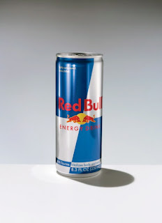
After my research I found out that the energy drink "Red Bull" was invented in Austria, but it doesn't really look like an Austrian product so I made it more look like one!
The green colour is because Austria is a very green country and the flag of one of the Austrian parts called "Steiermark" is grren & white.
I added the little flower called "Edelweiss" to it, because it"s a special flower which only grows in the mountains of Austria.

I made this special poster in my last school where I made my degree (Matura) for the London College of Commnication : HTL Ortwein in Graz


Another approach of my austrian poster is to look at
special Austrian architecture and create kind of a new building with it.
The technique is collage and I used old & modern architecture like:
• The 100 Wasserhaus in Vienna
• The arthouse in Graz
Schlossberg
Schoenbrunn
• The Stephansdom
Murinsel
• Different Castles
Rathaus Graz
Obertauern


After our little presentation in class my tutor told me to think about the background as well...maybe something with clouds, hmm... and during my research I came across this image!Which gave me the idea!!

Final:

Samstag, 13. Februar 2010

Typography workshop with Manuela Weiss

From January to march we had a special typography workshop every wednesday from 2pm - 5pm with a swiss typo artist: Manuela Weiss
She teaches us:

The german style of BAUHAUS:


ARTISTS:

[wolfgang weingart ]


[karl gerstner ]
[josef mueller brockmann ]


[emil ruder ]


[armin hofmann ]


DAY 1 - Grids

We got 2 different sizes of text and 2 sheets of paper(blue and yellow)
with those we had to create a page like those in the magazines:


Nick during teaching:


DAY 2 - Letting & Space

We got 2 words and we had to cut out the letters and stick them together by hand...So we had to work out the space between the letters by ourself. No Mac allowed!
mine: on the left side (Shameless, Reflection)

DAY 3 - The Vinyl Cover

We got Text and lines, nothing more to create the cover.
Find grids and work with them or use the text as an image!


First version

Second version (more focus on the stipes and not on the type)

Baackside:

2.Version: Text used as an image

Backside:


Animation in Photoshop


Poster/Folder> frontside

Backside>