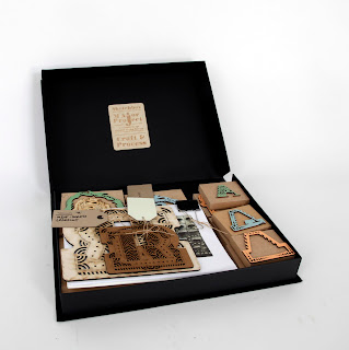
"The box"
is a collection of all the 3D laser cut evidence, test wood-cuts and final print templates for letterpress plus all 26- 2D hand-drawn designs on layers of tracing paper.
MY TYPEFACE
The letterforms I created are base on previous research in nature and natural textures. Graphical elements implemented in the bases of Henrik Kubel's fat face typeface named Vogue Paris. The shape of the elegant typeface forms the basis of my font which gave me the chance to experiment within the limited space. The typical elements I found, in the selected natural textures for each letter, are guiding the borders but still leaving enough opportunities to experiment and develop my typeface.
The letterforms are split into 3 layers, considering the furthers productions steps in techniques such as laser cut and letterpress.
Further on, it is vital to "think in laser cut":
This means, I have to consider where and what the laser will cut and which elements will fall out while cutting. This is a very important process as there is a possibilities that shapes will fall out which might be important for identification or readability of a letter.


Keine Kommentare:
Kommentar veröffentlichen